Today I want to dig in a little deeper about email marketing. Do you send welcome emails to your audience? If not, you’re missing out on a prime opportunity for conversions. That’s why I’m going to share welcome email examples to inspire you.
First, though, I want to make it clear why you should be sending welcome emails and how they can specifically contribute to better conversion rates. The more you engage with your audience, the better, but welcome messages are particularly beneficial.
What is Email Marketing?
Email marketing is the practice of communicating with your audience via email after they have opted in to your newsletter list. In other words, it’s a marketing campaign based on permission.
You present an offer to your audience. You might incentivize signups via a lead magnet, such as a free download, in exchange for your prospect’s email address. You then add the email address to your database and begin sending targeted messages.
Each email should build on the first message: the welcome email. That’s why this first correspondence is so critical. It sets the tone for the rest of your email marketing campaign.
What is a Welcome Email?
A welcome email introduces your brand to your audience in a specific and positive way. I’ll discuss some of the most popular types of welcome email examples below, but in most cases, you want to let your audience know that you’re going to provide value.
Whatever the case, show your audience they haven’t made a mistake by signing up for your email list.
Welcome Email Examples From Successful Businesses to Inspire Your Next Email Campaigns
Amazon
Amazon needs no introduction. It’s fantastic at all types of eCommerce marketing, from email to social. I’m particularly impressed with its welcome email, though.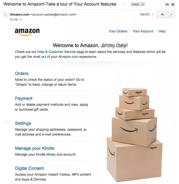
In this case, it reinforces the brand with that stack of boxes, each of which bears the Amazon logo. Then there are convenient hyperlinked subheadings naming all the major pages you might want to check out, plus a small bit of body copy underneath each to describe its benefits.
You might notice that it’s pretty simple. That’s okay, especially for a big brand.
Uber
Uber’s welcome email for customers (versus potential drivers) is a bit longer than Amazon’s. It includes several widely-spaced sections, which makes it easy on the eyes, and it incorporates the instructional aspect of welcome email examples very deftly:
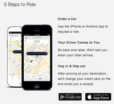
Easy as 1, 2, 3, right? The instructions also incorporate benefits, such as ease of use. That’s a great way to set apart your brand.
Other parts of the email include contact information and a brief thank-you to the subscriber.
TicketmasterIf you enjoy concerts and other events, you might be familiar with Ticketmaster. It’s one of the most popular places to buy and sell tickets.
When you buy tickets through Ticketmaster, you get a fantastic welcome email. There’s an animated gif right underneath the company logo as well as a friendly greeting.
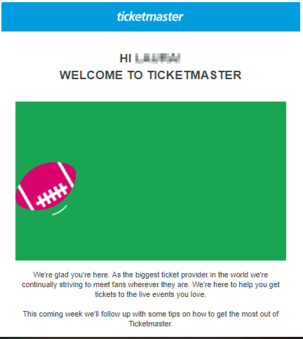
That’s an elegant and effective way to set up expectations. The subscriber knows exactly what he or she will get.
Nike
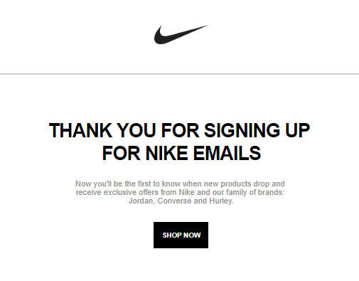
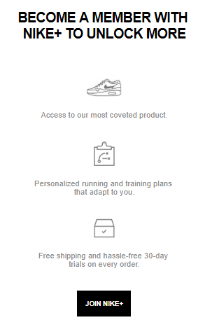
I like Nike’s welcome email because it’s short and sweet. First, you get a friendly introduction to the brand with the familiar Swoosh and a thank you. Then comes the value proposition, which tells you why you’ll thank yourself for signing up.
Todoist
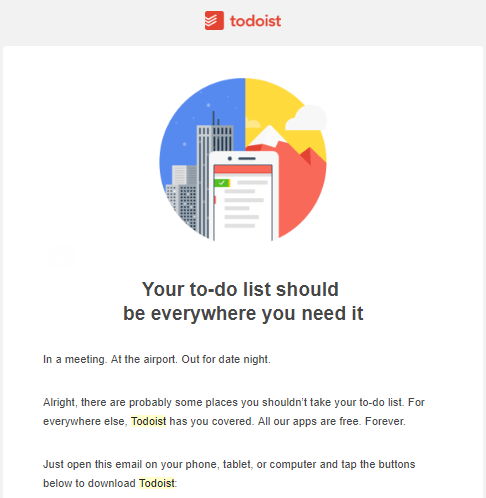
If you’re not familiar with Todoist, it’s an app that allows you to create electronic to-do lists. When you sign up for an account, you receive a welcome email. The first part welcomes you to the Todoist family and shares the benefits of a membership.
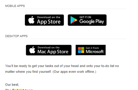
Couldn’t be easier, right? That’s the great thing about the best welcome email examples. They promote ease of use and help the subscriber take action immediately.
Benny Lewis
I wanted to include some brands in this list that people might not know about. Benny Lewis is an expert in teaching people how to learn new languages faster and easier by simply speaking the target language.
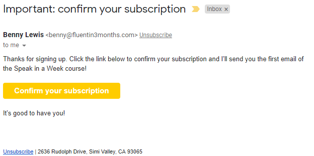
When you sign up for his emails, you get a short and sweet confirmation email that reinforces the value of his lead magnet.
Bicycling.com
I love the welcome email from Bicycling.com. I signed up for a gift subscription because I have a friend who wanted to learn more about cycling, and I received this in my inbox moments later:
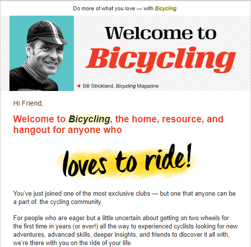 It’s colorful, positive, and conveys exclusivity. It’s also heavily focused on the magazine’s USP, and it makes beginners feel comfortable and welcome while still acknowledging that veteran cyclists can benefit from their subscriptions. Awesome.
I love the welcome email from Bicycling.com. I signed up for a gift subscription because I have a friend who wanted to learn more about cycling, and I received this in my inbox moments later:

We might as well acknowledge Facebook here because the company has marketing down to an art and a science. Its welcome email is deceptively simple, but that’s because it wants users to do one thing: Engage with their followers on Facebook.
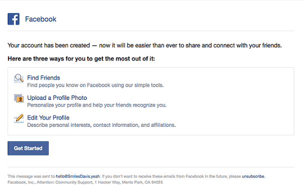
It tells you exactly how to do just that with links to find friends, upload a profile photo so you’re more visible, and edit your profile so it matches what you want to share.
Then there’s a Get Started CTA for good measure. Well done.
Nextdoor
If you haven’t given Nextdoor a try, you might want to consider it. It’s a social networking site that unites people who live in the same neighborhood, community, or general geographic area. Its welcome email is simple but effective.
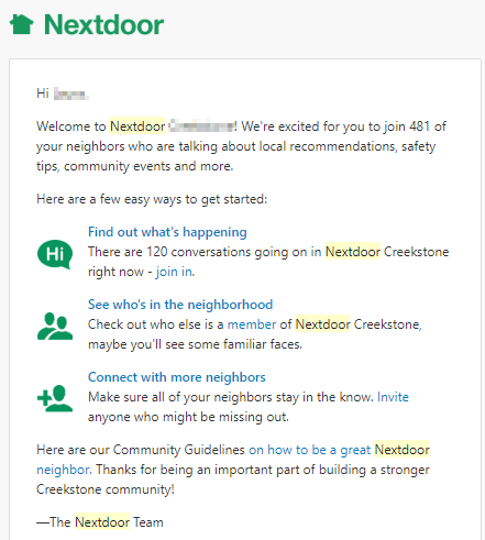 First, there’s social proof. It tells you how many of your neighbors have also signed up. Then there’s a list of benefits for members.
Then you have a list of CTAs so you can immediately interact with the site.
If you haven’t given Nextdoor a try, you might want to consider it. It’s a social networking site that unites people who live in the same neighborhood, community, or general geographic area. Its welcome email is simple but effective.

Then you have a list of CTAs so you can immediately interact with the site.
Medium Partner Program
Medium.com has a Medium Partner Program, which allows writers and other content creators to get paid for the work they publish on the platform. When you sign up, you get a fantastic welcome email.
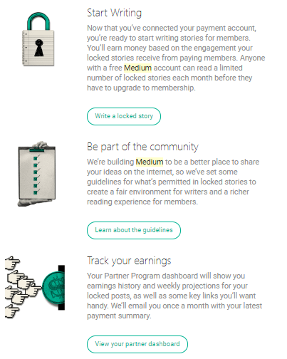 After a personalized welcome message, Medium tells you exactly how to get involved with the community, publish content, and keep track of your earnings.
Medium.com has a Medium Partner Program, which allows writers and other content creators to get paid for the work they publish on the platform. When you sign up, you get a fantastic welcome email.

ButcherBox
ButcherBox allows you to sign up for a subscription plan that delivers meat to your front door at regular intervals. If you sign up for the ButcherBox mailing list, you get a welcome email that invites you to get a subscription and enjoy free meat in the process.
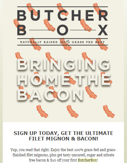 Not only can you get filet mignon and bacon for free, but you also get $10 off your first box.
This is a great example of marketing in general. The company is tempting its subscribers with an excellent offer for people who value well-priced meat and the convenience of delivery.
ButcherBox allows you to sign up for a subscription plan that delivers meat to your front door at regular intervals. If you sign up for the ButcherBox mailing list, you get a welcome email that invites you to get a subscription and enjoy free meat in the process.

This is a great example of marketing in general. The company is tempting its subscribers with an excellent offer for people who value well-priced meat and the convenience of delivery.
Magnolia Market
Even if you’re not an HGTV fan, you’ve probably heard about Chip and Joanna Gaines. They’re the stars behind “Fixer Uppers” and have become serial entrepreneurs. Their ecommerce store, Magnolia Market, has an awesome welcome email. First, you get a photograph of the proprietors.
 Then there’s a big thank-you along with the lead magnet: a 15-percent-off coupon.
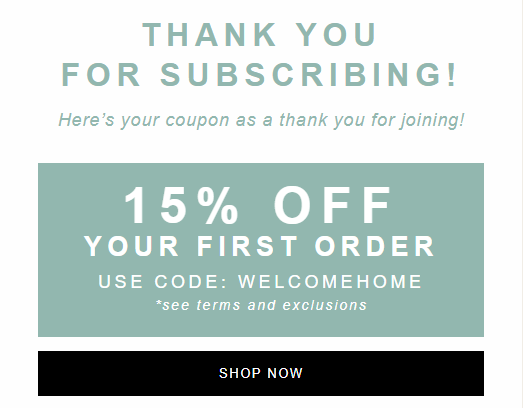 See the SHOP NOW CTA? It’s bold and has lots of contrast, which means people are more likely to click it. Associating the discount with the SHOP NOW offer makes it more attractive. Yes, you’ll spend money, but you’ll get a discount in the process.
Even if you’re not an HGTV fan, you’ve probably heard about Chip and Joanna Gaines. They’re the stars behind “Fixer Uppers” and have become serial entrepreneurs. Their ecommerce store, Magnolia Market, has an awesome welcome email. First, you get a photograph of the proprietors.


Use Welcome Bar to Get a Lot More New Subscribers To Your Email List
You’re fully versed in welcome emails by now, so how do you put them in action? You start collecting email addresses.
Welcome Bar allows you to introduce a lead magnet, display your GDPR compliance, and collect email addresses without any friction. And that’s important.
These days, people are inundated with emails. They aren’t going to want them from you unless you give them a darned good reason.
Supercharge your email collection process by using a top bar, slider, modal, exit popup, or other bar to let people know what they can get for signing up. Use a strong call-to-action phrase that makes visitors want to click.
Practice writing headlines, too. The stronger your headline, the more people will pay attention.
Conclusion
You didn’t think your welcome email was important, did you? Now you know different.
If you’re able to engage your subscribers from the moment they provide you with their email addresses, you’ll hit the ground running — and set yourself up to generate more revenue.
There are lots of different types of welcome email examples. Send a list of instructions for your free demo trial, a product catalog, an introductory email, or a social proof email. Demonstrate your credibility and your gratitude to the subscriber.
I also urge you to review the 12 welcome email examples I showed you. Figure out what you like about each and what you don’t.
The more you experiment, the stronger your emails will become. A/B test them over and over again to find that sweet spot.
What’s the best welcome email you ever received?


No comments:
Post a Comment